
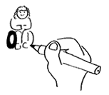
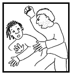
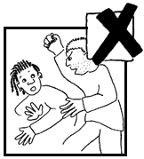
Try to pick pictures that will show most clearly what you want to say.
Don't just choose a few pictures and scatter them about in the document.
It might make it look more user friendly but it won't make your information any easier to understand.
Use easy words and short sentences.
Don't put loads and loads of words on one
page.
Make sure there is space on the page and pictures too.
Use pictures and photos.
Use big writing
(a minimum size of 14 points).
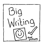
Use a clear font like
Arial, Avant Garde or Helvetica.

Use lower case text as much as possible. Try not to use too many capital letters.

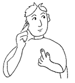
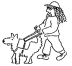 Remember a lot of people with
learning disabilities may also be
blind or deaf.
Remember a lot of people with
learning disabilities may also be
blind or deaf.

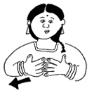
Think about using British Sign Language.
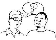
And most importantly ask people with
learning disabilities what they think.
Is it easy to understand or is it confusing?
What could be done better?
Remember that you can change the pictures so they show more clearly what you want to say.
 |
 |